Double Complementary Color Scheme: The Ultimate Guide to Colours for Design, Interiors, and Fashion
Colour plays a crucial role in how we perceive and interact with our environment, whether in art, interior design, fashion, or digital media. The double complementary color scheme is one of the most versatile and dynamic colour palettes, combining two sets of complementary colours to create a bold, vibrant, and harmonious look. This scheme allows designers and creatives to experiment with contrast while maintaining visual balance.


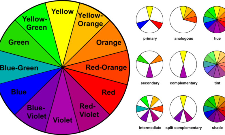
Using a double complementary color scheme effectively requires a clear understanding of colour relationships on the colour wheel. It is often referred to as a tetradic colour scheme and consists of four colours forming two opposing complementary pairs. While the palette offers energy and richness, careful application is necessary to avoid visual clutter. When mastered, it can elevate any space, artwork, or outfit into something striking and memorable.
What is a Double Complementary Color Scheme
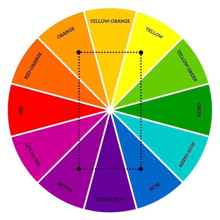
A double complementary color scheme is a design strategy that uses four colours arranged in two complementary pairs. For example, red and green combined with blue and orange create a lively and energetic palette. The scheme is ideal for those seeking contrast without losing harmony. It allows more flexibility than standard complementary colour schemes, making it suitable for interiors, graphic design, art, and fashion.
The double complementary color scheme differs from simpler colour arrangements because it requires attention to balance and proportion. One colour should dominate, while the remaining three act as supporting accents. This prevents the design from becoming overwhelming and ensures that each hue enhances the others. This technique is particularly valuable in interior design and digital applications, where multiple colours must coexist seamlessly.
How to Use a Double Complementary Color Scheme
Applying a double complementary color scheme effectively requires strategic planning. Designers must decide which colour will dominate and which colours will serve as accents to create a harmonious balance. Adjusting brightness, saturation, or tone can prevent colours from clashing and create a visually appealing composition. Using neutral tones like white, grey, or black can also soften the intensity of the palette.
This colour scheme can be applied in a variety of contexts, from room décor to graphic design and fashion. In interiors, walls or large furniture pieces are often the dominant colour, while smaller accessories like cushions, curtains, or rugs introduce the secondary colours. In art and digital design, careful placement of contrasting colours can draw attention to focal points. When done correctly, a double complementary color scheme results in a cohesive yet vibrant visual experience.
Double Complementary Color Scheme in Interior Design
The double complementary color scheme in interior design can transform any space into a bold and engaging environment. For example, a living room might use blue and orange as the dominant tones, with red and green accents. By balancing these colours with neutral shades, designers can create a room that feels energetic yet inviting. This approach works well in modern, eclectic, and even traditional interiors.
Bedrooms, offices, and kitchens can also benefit from a double complementary color scheme. In bedrooms, the scheme can provide a dynamic yet relaxing atmosphere when the colours are carefully balanced. Office spaces can feel more stimulating and creative with the right combination of hues. Using accessories such as cushions, rugs, or artwork is an excellent way to introduce accent colours without overpowering the dominant tones, ensuring a harmonious and visually pleasing design.
Double Complementary Color Scheme in Art and Digital Design
Artists and digital designers frequently employ a double complementary color scheme to create visually striking compositions. In painting, the palette can add depth and energy, emphasising contrasts while maintaining cohesion. Digital designers use this scheme for websites, social media graphics, and branding, creating eye-catching visuals that stand out without appearing chaotic or unbalanced.
This colour strategy is also valuable for marketing and branding. By carefully selecting a dominant colour and complementing it with three secondary hues, designers can guide viewers’ focus and evoke specific emotions. Whether for posters, advertisements, or digital illustrations, the double complementary color scheme examples show how this palette can add energy, depth, and sophistication to a creative project, making it highly versatile.
Double Complementary Color Scheme in Fashion
Fashion designers often turn to the double complementary color scheme to craft outfits that are both bold and harmonious. Pairing two complementary colour pairs, such as green and red with purple and yellow, can create visually dynamic ensembles. By selecting one colour as the primary focus and using others as accents in accessories or layering, the scheme ensures cohesion while allowing creativity to shine.
This approach works well in everyday outfits as well as formal and professional attire. For example, dresses, suits, or casual ensembles can integrate this scheme to produce interest and variety. Accessories, shoes, and scarves provide opportunities to include accent colours without overwhelming the overall look. By experimenting with combinations and tonal adjustments, a double complementary color scheme outfit can be both stylish and balanced.
Examples of Double Complementary Color Schemes
Practical examples help illustrate the power and versatility of a double complementary color scheme. Classic examples include red paired with green alongside blue and orange, or yellow combined with violet and blue-violet with yellow-orange. Adjusting saturation, lightness, or dominance allows these combinations to be tailored for rooms, outfits, or digital projects without losing harmony or visual appeal.
Visual tools, such as colour wheels or swatches, are useful when experimenting with this palette. They help designers visualise the relationships between complementary pairs and make informed choices about balance. By understanding the interplay of these four colours, creatives can explore a wide variety of projects, from interior spaces and artwork to fashion ensembles, demonstrating the scheme’s versatility and timeless appeal.
Conclusion
The double complementary color scheme is an exceptionally versatile and dynamic approach to colour in design, interiors, art, and fashion. By combining two sets of complementary colours, it produces a vibrant and energetic effect that draws attention while maintaining harmony. With careful attention to dominance, balance, and neutral integration, this scheme can transform ordinary designs into striking and sophisticated compositions.
Whether you are decorating a room, creating digital artwork, or putting together a stylish outfit, the double complementary color scheme offers endless possibilities. By understanding its principles and experimenting with colour relationships, anyone can harness this palette to create visually captivating results. Its ability to merge contrast, depth, and harmony makes it an indispensable tool for designers and creatives alike.