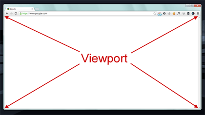
Understanding what is my viewport is essential for web designers, developers, and even everyday users who care about how websites appear on different devices. The viewport is essentially the visible area of a webpage within your browser, which can change depending on the device, screen resolution, and even browser settings. Knowing your viewport allows you to create websites that are visually appealing and user-friendly.


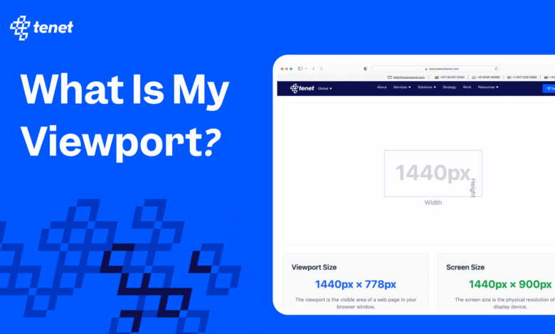
When you ask what is my viewport, you are trying to determine the width and height of the browser window displaying the website. This information is crucial for responsive web design because it ensures that content fits correctly on screens ranging from large desktop monitors to small smartphones. Optimizing for viewport size enhances user experience and can boost your website’s performance in search engine rankings.
Understanding what is my viewport and its importance
The question what is my viewport goes beyond just numbers. It defines the area where all your webpage content appears and affects layout, readability, and functionality. For example, a website designed without considering viewport size might have text that is too small or images that overflow the screen on mobile devices. Understanding viewport size helps avoid these design issues.
Viewport dimensions are particularly important for developers using CSS media queries. These queries adjust styling based on width, ensuring content is correctly displayed on all devices. By knowing what is my viewport, designers can make decisions about column layouts, font sizes, and image scaling to provide a seamless user experience. A well-optimized viewport directly impacts usability and user satisfaction.
How to check what is my viewport
Checking what is my viewport is straightforward with modern tools. One of the easiest methods is using your browser’s developer tools. For instance, in Google Chrome, you can open the developer tools, click on the responsive design icon, and view your current viewport width and height. This gives precise measurements and lets you simulate multiple device types.
Besides browser tools, online viewport checkers are invaluable. Websites dedicated to measuring viewport size provide instant results, showing both width and height for your device. Developers can also use JavaScript functions like window.innerWidth and window.innerHeight to dynamically obtain viewport dimensions. These tools make it quick to answer the question, what is my viewport, for any project or design test.
Understanding viewport width when asking what is my viewport
Viewport width is a key factor when you want to know what is my viewport. It determines how content stretches or shrinks across different screen sizes. Designers rely on viewport width to set breakpoints in CSS that control how elements rearrange themselves for tablets, mobile devices, and desktop monitors. Without considering viewport width, web pages can appear cluttered or unreadable.
Viewport width also influences responsive images, font scaling, and layout grids. By knowing what is my viewport, developers can create adaptive designs that maintain usability and aesthetics regardless of device type. Proper use of viewport width ensures websites are both functional and visually consistent, which is critical for retaining visitors and improving SEO performance.
Common issues when checking what is my viewport
Sometimes, what is my viewport may not return expected results due to zoom settings or device-specific quirks. Browser zoom can increase or decrease viewport dimensions, affecting how content is displayed. Mobile devices often scale content automatically, which may lead to discrepancies in measurements. Understanding these issues helps designers troubleshoot layout problems efficiently.
Orientation changes are another common factor. Rotating a device from portrait to landscape can drastically change the viewport width and height. Checking what is my viewport after orientation shifts ensures your website adjusts appropriately, maintaining readability and user experience. Developers who ignore these variables risk creating pages that look great on one device but fail on others.
Tools and resources to find what is my viewport
Several tools make answering what is my viewport simple and accurate. Online viewport checkers, browser developer tools, and even browser extensions can display width and height instantly. Many of these tools allow you to test multiple devices and simulate different screen resolutions, which is essential for responsive design.
Additional resources include tutorials, blogs, and forums dedicated to web design and development. These guides explain viewport concepts in detail, helping beginners and experts understand not only what is my viewport but also how to use viewport data to improve layouts, accessibility, and user experience. Leveraging these resources accelerates learning and enhances project outcomes.
Conclusion
Knowing what is my viewport is fundamental for creating websites that work seamlessly across devices. By checking viewport size and width, developers and designers can optimize content for readability, usability, and overall user satisfaction. Whether you’re building a personal blog, a corporate site, or an e-commerce platform, understanding viewport dimensions is essential for responsive design and better SEO performance.
Regularly checking what is my viewport ensures that your web pages display correctly and remain user-friendly, no matter the device or screen size. Taking the time to understand viewport width, height, and how different devices interpret them can save hours of troubleshooting and provide a professional, polished website experience for all visitors.